Why Senior Living Communities Are Turning to Kiosk Surveys for Resident Feedback
Why Senior Living Communities Are Turning to Kiosk Surveys for Resident Feedback An estimated 70% of senior living executives now say real-time feedback is critical


Imagine you’re taking a customer satisfaction survey. The first option is ‘Excellent,’ followed by ‘Good,’ ‘Neutral,’ ‘Poor,’ and ‘Terrible.’ Are you more likely to choose ‘Excellent’ simply because it’s the first option you see? The order of rating scale options can significantly influence survey results, a phenomenon known as order bias.
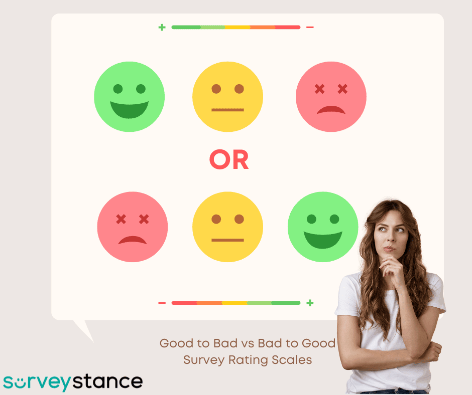
We frequently receive questions about the impact of rating scale order (good to bad vs. bad to good) on survey results. Our analysis of millions of survey responses at SurveyStance reveals a significant influence.
Numerous factors can influence survey results, including the order of response options. We’ll share some tips for crafting effective questions and how scale order affects responses and offer recommendations to help get you started.
Horizontal Likert-based survey rating scales, where responses are read from left to right can significantly influence the way respondents interpret and choose their answers. This layout often has the most substantial impact when the scale ranges from “Good” to “Bad.”
This tendency is known as the primacy effect which suggests that people tend to remember and choose the first items in a list. Because we read from left to right, the first option on a horizontal scale often receives more attention and is therefore more likely to be selected. While the primacy effect is most pronounced with horizontal scales, other factors can also influence responses, such as the use of visual cues like emojis.
Our analysis of millions of survey responses at SurveyStance revealed that when using a ‘Good to Bad’ scale, respondents were around 15% more likely to select ‘Good’ than when using a ‘Bad to Good’ scale.
This means that respondents are more likely to select the first option presented, whether it’s ‘Excellent’ or ‘Strongly Agree.
Use Ascending Scales (Bad-to-Good)
Presenting response options in ascending order—starting with the most negative or neutral option and progressing to the most positive—helps minimize bias. This approach feels natural to most users, as it’s the standard in many feedback tools and ensures the data collected is more reliable.
However, if your goal is to boost ratings or encourage positive feedback, starting with the most positive option can subtly nudge users in that direction. Keep in mind the trade-offs between accuracy and strategic framing when deciding on the scale order.
Ensure Clear, Unambiguous Wording
The wording of your response options is just as important as their order. Ambiguous or confusing language can distort results and frustrate users. Keep your questions and scales simple, direct, and easy to understand. Avoid using industry jargon, technical terms, or overly complex phrases that could alienate your audience. Clear language ensures feedback reflects genuine opinions rather than misinterpretations.
A survey rating scale is a set of defined survey responses that can be used to quickly answer a survey question. The survey rating scale can be numeric (example: 1-10) or qualitative (example: Always – Never).
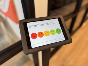
Survey scales can also be picture or emoji based, for example very mad emoji – very happy emoji. Survey rating scales can be used to collect feedback on anything from customer satisfaction to employee engagement.
The rating scale 1-5 poor to excellent is one of the most popular survey scales. It’s simple, versatile, and easy for respondents to understand. Here are some variations of this scale, also known as a Likert scale:
Understanding the impact of rating scale order is crucial for collecting accurate and reliable survey data. By using ascending scales and clear wording you can minimize bias and ensure that your results reflect genuine opinions. Contact SurveyStance today to learn more about optimizing your survey design.

Why Senior Living Communities Are Turning to Kiosk Surveys for Resident Feedback An estimated 70% of senior living executives now say real-time feedback is critical

Public libraries are evolving to meet the changing needs of their communities but how do you ensure your library stays relevant and valuable? The answer
